We don’t often wonder about the impact that colours have on our shopping habits, purchasing patterns, or moods, but the undeniable fact is that colour affects our lives in many ways. And for that, I would like to share the meanings behind a cluster of colours, as well as the impact that fonts have in brand design.
In this image above we see a multitude of colours overlapping one another to create new color palettes. We see dominant colors in this image that create different types of emotional responses. For this reason, brand managers, creative designers, and advertisers must understand the evoked responses by consumers that colours have in order to implement various shades and tones in adverts, logos, packaging designs, and more. Below I will describe the colours being used in this image.
- Bright Red: Stands for excitement, energy, sexiness, stimulation, provocateur, drama, aggression and power
- Bring Pink: Stands for excitement, happiness, attention, energy, youth, spirit, fun, wildness
- Light Pink: Stands for romance, softness, sweetness, tenderness, cuteness, babies, and delicacy
- Orange: Is whimsical, fun, glowing, happy, childlike, vital, sunset, harvest, hot, juicy, tangy, friendly, and loud
- Golden Yellow: Stands for autumn, flowers, harvest, richness, sun, warmth, wheat, comfort, sunbaked, and butter
- Bright Yellow: Stands for enlightenment, sunshine, cheer, friendliness, luminous, and energy
- Bright Green: Stands for freshness, grass, the Irish, liveliness, the Spring, foliage, and the outdoors
- Dark Green: Stands for nature, trust, refreshment, coolness, forests, quietness, woods, tradition, money, and rest
- Teal Blue: Is pleasing, rich, classy, expensive, and unique
- Sky Blue: Is calms, quiet, peaceful, cool, water, and clean
- Blue Purple: Is mystical, spiritual, futuristic, fantasy, and meditative
- Red Purple: Is exciting, sensual, flamboyant, creative, and unique
The list can go on and on, but for this case and matter, it is clear to see the emotions that lie behind a “pretty colour”. Moreover, it takes a lot of effort and planning before choosing a colour, or colours, to represent a brand. This strategy was implemented in 2009, where McDonald’s restaurants across Europe (mainly in Germany) changed their logo colours from Red and Yellow, to Green and Yellow. This was in effort to create a more sustainable, healthy look for McDonald’s. Green, standing for coolness and refreshment, and yellow standing for energy and enlightenment. These emotions were paired in order to create a more happy, healthy, energy efficient look from the fast-food chain’s pre-existing labels of being “unhealthy” and “fat food”. 
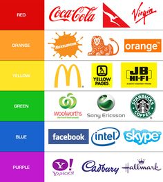
Will the new colours work? We will have to wait and see! But frankly, I think the restaurant has established themselves as fast food, including their staple of burgers and fries, which, in any world, will never be considered “healthy”. In addition to McDonald’s shocking logo colour change, we have these globally known brands and companies in their respective colours:
But what happens if we change some of the colours of these brands? Do the same feelings transfer? 
Ah, now that can be an issue. TRANSFERABILITY. A Brand’s Identity depends on the colour and font chosen for the logo, therefore, with change comes a big price in consumer recognition and trust. For example, when Coca Cola switched the holiday can from red to winter white in order to promote Polar Bear Care, they received negative feedback, including comments on how the “taste was different” and how the can was too closely related to the diet coke can colour. It was for these, and similar reasons, that Coca Cola pulled back on the distribution of the white cans and stopped them from being displayed in stores altogether.
So for all of you creatives out there; don’t forget to pair your fonts and colours with your core brand values and make sure that they reflect the emotions and imagery that you are trying to reflect from your company and/or product or service. Pantone colours are as usual the safest in terms of assuring quality colours worldwide, with RGB being used for websites and CMYK for print. Attached to the word Pantone is a clip that may offer some assistance in creating new colours on Adobe Photo Shop, In Design, or Illustrator. I hope this may help you in your future artistic OR business careers. Until the next post my lovely readers!


