
“Artists can color the sky red because they know it’s blue. Those of us who aren’t artists must color things the way they really are or people might think we’re stupid.”
—Jules Feiffer
Agree or disagree? As a brand enthusiast, it is easy to deduct what Jules Feiffer is so cleverly stating: simple, simple, and simple. Why cloud the consumers’ memory with noise and imagery when the alternative is to build a relationship with your consumer through ease of usage, clarity and recognition? It doesn’t take a genius to choose the latter, but it does take courage to become a naked brand.
What I mean by that is an open, honest, and straight-to-the-point brand. Take Budweiser for example, they don’t try to be the world’s leading beverage; they are simply the merrymaking beer. They do not try to sell sophistication because they know they are not a sophisticated brand, rather they sell experiences, laughs and memories through their advertising efforts and marketing skills. It can be seen in commercials that their products are for sharing and for bonding, and most of their adverts use the element of minimalism to reinforce the brand in the consumer’s mindset. They have created themselves through core brand values, which in turn have helped them to create a strong presence in consumers’ minds.

There is no need for “visual vomit” because they have built a trust with their consumers. They understand the value of their product and what it brings to customers, therefore, there is less need to convince people to purchase their product, but more of a need to build a relationship with their end users.

Budweiser has chosen very recognizable colors for their packaging design, such as red and white, which are both warm and complimentary on the color wheel. It is very important to include colors that are well paired so that they become attractive on a shelf full of other multi-colored beverages. The warmth of the red displayed across the product packaging design and in the adverts of Budweiser holds a strong link to the emotions behind the products. To reinforce this idea, the use of the color orange and red in many commercials for Budweiser invites the feeling of warmth, which psychologically tugs on nodes in the brain that link the product to the consumers’ image of the brand. More specifically, in adverts, the alignment of the product and the tag line are very closely placed so that the mind is firstly directed at the contrasted image, but then searches for a meaning, which they can easily find underneath or above the logo or beer bottle/can. This is a common theme for the design in Budweiser adverts.
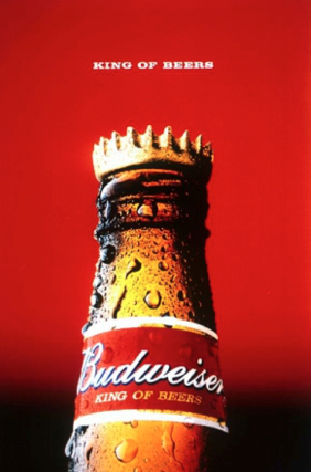 Here you can see the colors representing warmth so that the bottle of beer appears to be refreshing as the perspiration is being focused on so intently. The bottle cap flipped upside from its original positions also signifies the simple and subtle change or perspective that exemplifies Budweiser is the King of Beers. No actions, or excessive images need to be used.
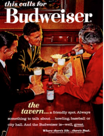

Here are two examples of the emotion behind Budweiser adverts. They are shown here through emotional, and memorable experiences that can only be had with Budweiser present. The E+P combinations in these two adverts signify bonding, tradition and happiness.

This advert shows how symmetry plays a role in branding design because it represents a balance, making the design lighter and more eye-catching. The use of isolation is also in effect because all that surrounds this can of Budweiser are words to describe the reason behind the advert. The new packaging design is being introduced, but also there is a touch of brand value added into the “Bowtie” can, because it suggests the beer relates to the responsibility and class that bowties normally represent.
Overall, the elements and principles of brand design are very essential to a successful brand. Of course there are Do’s and Don’ts in creating the components of brand design, however, it is most important to understand the values that the brand cherishes and exhibit those values through adverts, packaging, or even publicity stunts. Being a “naked” brand and showing intrinsic value is what will allow consumers’ to trust your product.
