 Interestingly, McCann Worldgroup, the parent company of eight businesses, which include well-known brand and advertising agencies McCann Erickson, and Futurebrand, had taken it’s own skills and rebranded themselves. Taking a company that started out in 1997 to a global business with parent companies called for a change in brand identity. Thus, in 2011, McCann Worldgroup became a marketing solutions entity by “transforming brands and growing businesses.” By marketing their own talents and developing a corporate brand identity, FutureBrand helped institute the value of this multi-million dollar corporation.
It was important to McCann Worldgroup to brand themselves as a company that devotes themselves in integrating advertising, relationship management, promotions/event marketing, design, P.R., health communications, worldwide production, and all forms of digital marketing. But how could they do this?
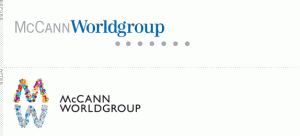
After what seems as a lot of trial and error, McCann Worldgroup had finally chosen their new Brand logo to compliment their revamped Brand Identity. The use of visually opposite “M” and “W” letters is very fresh and appealing, and indicates that two forces were joined together. It shows strength, unity, a wide skill set, and transformation; all which are values closely related to the brand and company as one. This is what the Before and After Logo looks like:

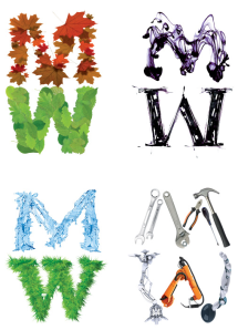
What a difference huh? Going from gray and blue colored text and subscripted dots, to a more vibrant, interactive logo really impacts the clients as well as the audience as to what type of company they are dealing with. Although some may call the new logo “naive”, I think it adds a bit of trust in saying that ‘We are just as creative as we are technical. Therefore, handling all of your needs is our weapon.’ I sense this type of attitude through the color choices from warm colors representing design, and cooler colors representing technology, computers, and machinery. Notice they have removed the irrelevant dots from the first logo and have used a different font for the company name? These attributes I will touch upon in my next post. Please check back in to learn more about these features!

